16 Creative Resume Ideas From Graphic Designers All Over The World

Ah, resumes, possibly the single most nerve-wracking document you will produce during the job hunt. It’s become so crucial that there’s even a science to resume writing. Before stressing over the appropriate outfit, you might want to check that your resume is properly dressed too.
But while you can never really go wrong with a classic resume and allowing your qualifications to speak for themselves, it won’t hurt to raise the bar a little higher. These 16 designers took their resumes to the next level, and not only do they let their qualifications speak for themselves, they also let their resume ideas themselves speak for their qualifications.
Whether or not you’re a graphic designer by profession, you can learn a lot from these resumes on how to make your resumes look clean, pretty, and unique. But remember, the most important purpose of a resume: to clearly showcase your skills and experience so that employers will know that you’re the most qualified candidate of them all.
TOPICS
1. Clean, minimalist, and geometric
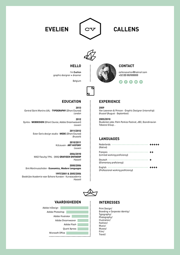
Evelien Callens keeps things short and sweet with her clean design, but the origami geometrics add a welcome dimension of personality to her resume. Her use of a single color, a mint-moss green, goes with the light organization of information and her title branding. Check out other designs by this Belgian dreamer.
2. Futuristic space stationery
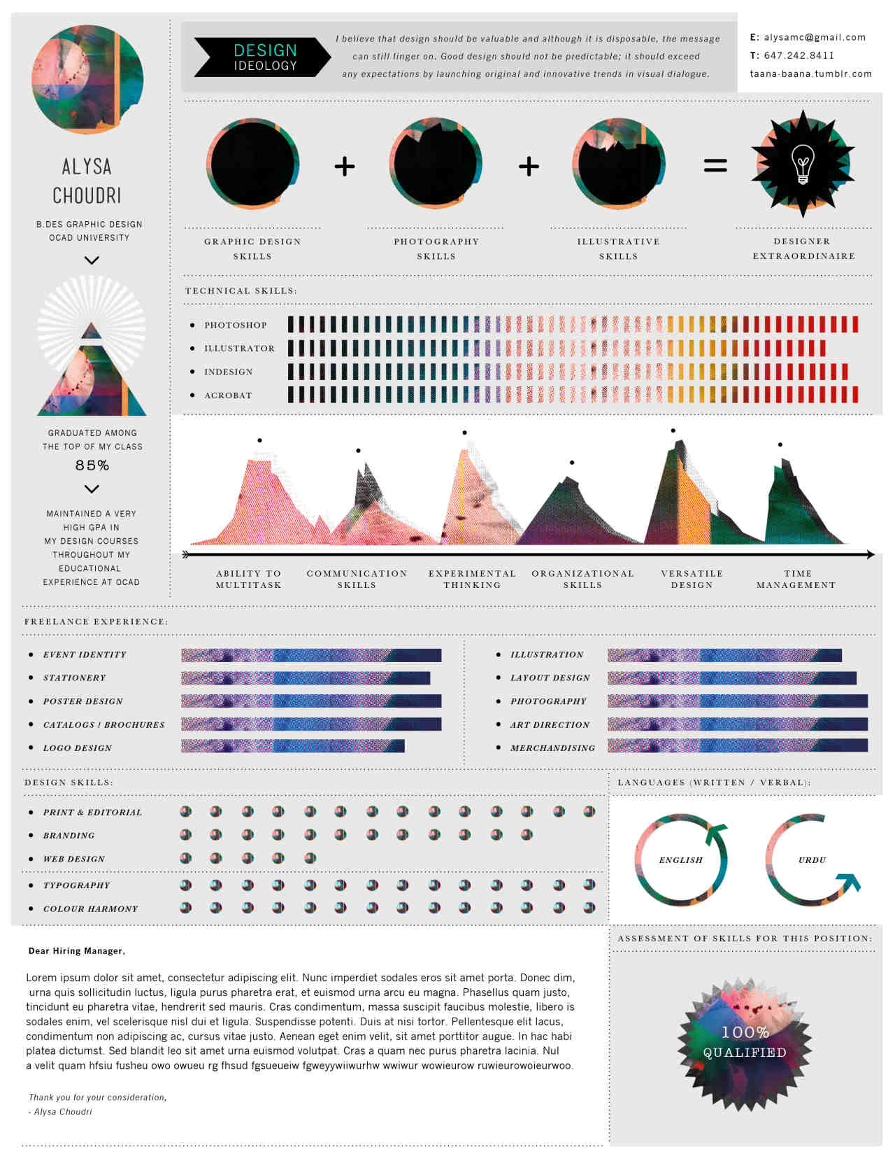
Things get real wild, real fast with Alysa Choudri’s psychedelic brainchild. If you look closely, her resume managed to squeeze in a lot information without looking too cramped. You can also tell by her Tumblr page that this designer loves color and crazy.
3. Help them decide faster with a flowchart
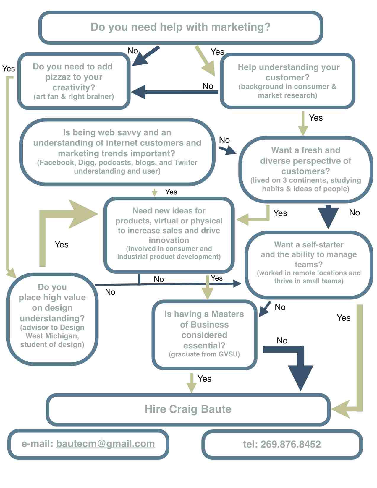
Craig Baute is a freelance market researcher who helps clients “discover trends.” By the looks of his resume, he also helps recruiters discover him. It’s a smart tactic to purposely lead the recruiter’s eye to certain sections or information on your resume. Craig isn’t a graphic designer but his website, craigbaute.com, has some great reads on productivity and community.
4. Geometry at its finest
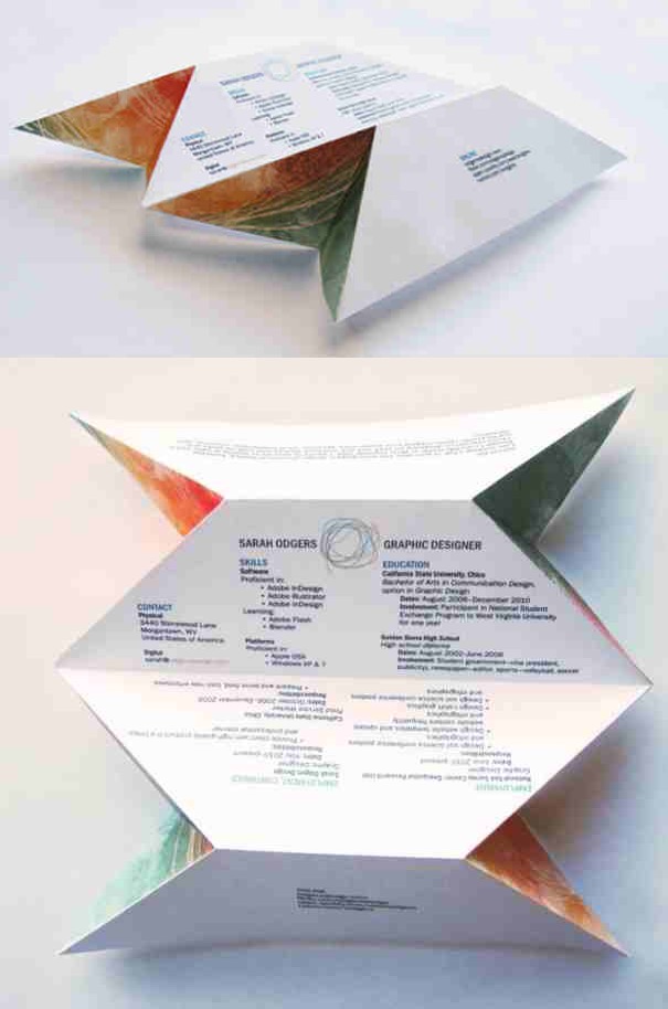
This installation resume by Sarah Odgers might be the most unique one of the bunch. The front faces of her geometric resume stay quite true to classic but tilt it a few degrees to either side and there is an explosion of color that look like cuts through the earth’s layers. This one would not even fit in the pile, so we don’t suggest you try this in your next application just yet. Venture into odgersdesign and be amazed.
5. Vintage classified ads
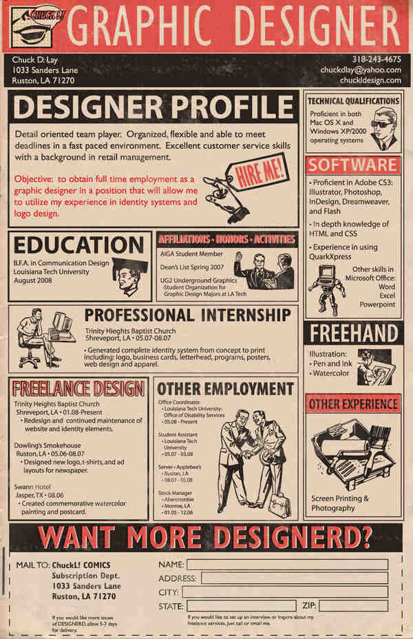
Your parents or grandparents might see Chuck Lay’s resume and think it was from an old magazine. A lot of Chuck’s inspiration comes from comic books, too. He’s even created an alter-ego superhero for himself called Designerd. For more on Chuck and Designerd, click here.
6. Google yourself
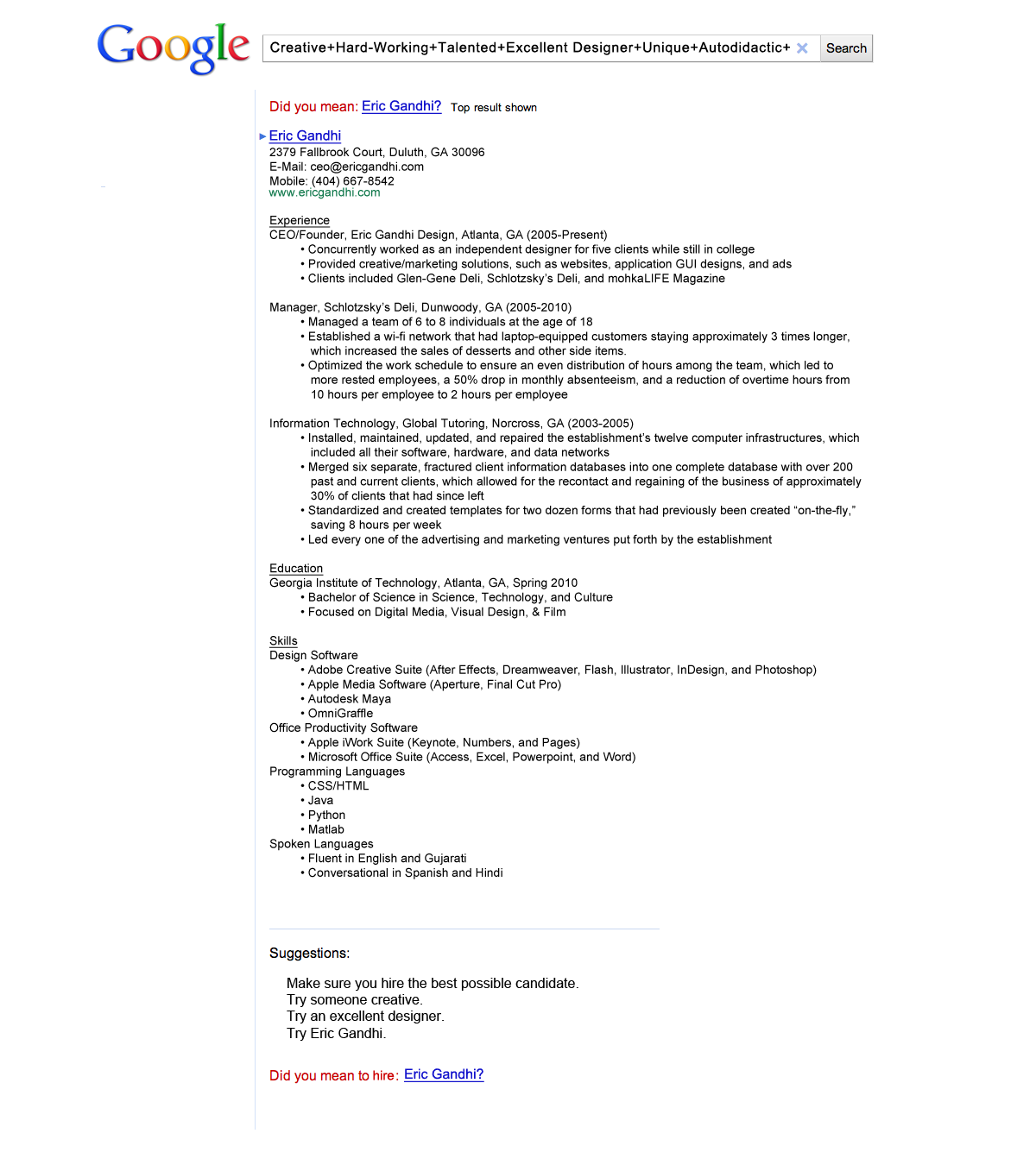
This one by designer Eric Gandhi is so simple it’s brilliant! Nothing more than a couple of fonts and the Google logo. Ironically enough, Eric’s Google resume landed him a job at the same multi-billion dollar company. You can look through his designs (and updated resume) on ericgandhi.com.
7. A splash of watercolor
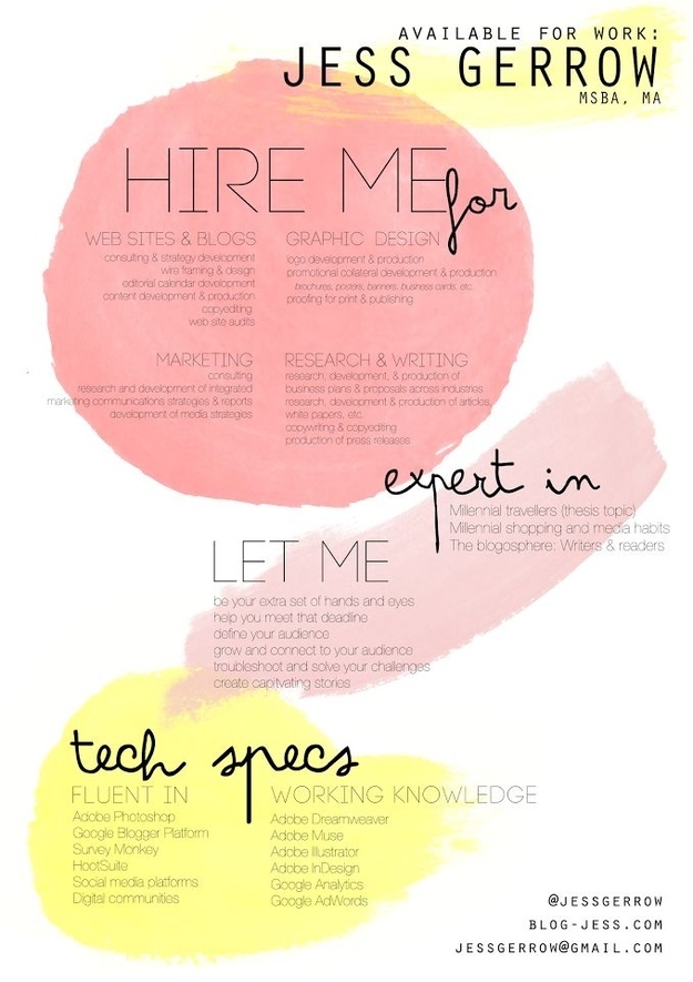
Jess Gerrow is a Canadian designer living in Malta who works with “key strokes and brush strokes,” both of which are clearly evident in her almost colorful resume. She’s been featured on sites like Lonely Planet, BuzzFeed (for her resume), and The Verge. Follow Jess’ work on her travel and lifestlye blog, The Stroke.
8. Fabric resume. Fabric.
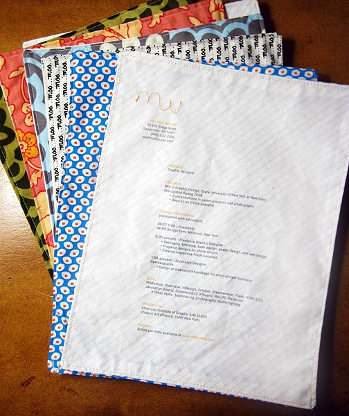
This Flickr bug who goes by the username Melissa loves sewing and wanted to incorporate that into her resume, literally. She printed her resume onto iron-on paper and then transferred that onto white fabric, which she then sewed onto various patterned fabrics. Yet another example of “it’s so simple, its brilliant!”
9. Black and white, but definitely classy
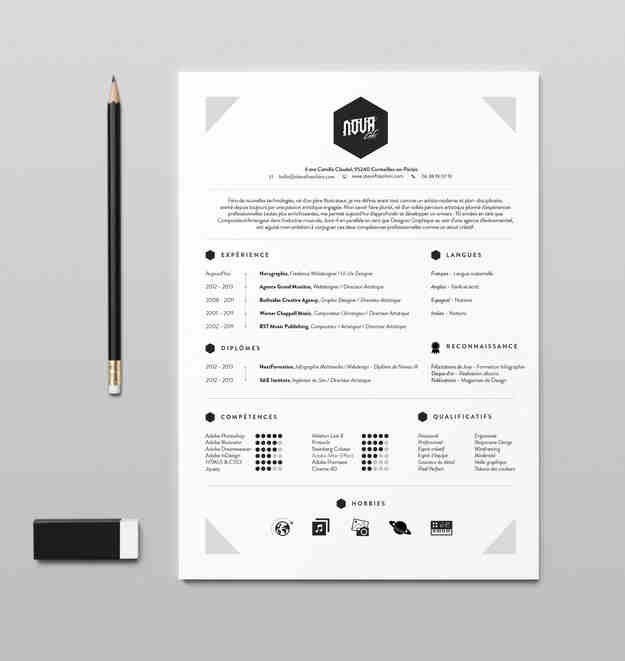
Steve Fraschini proved that classy can still win the game. While Steve’s resume is a simple stand out, his other designs are a little more out there. Take a look at the portfolio of the Pixel Samurai from Paris.
10. Graphic resume
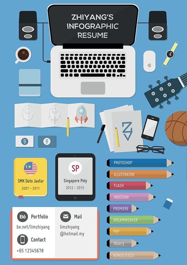
Singapore based designer Zhiyang Lim’s cartoon-like resume has a mere 15 items on it but still you can tell a lot about him, his skills, and his interests. He tells a story with his resume without actually telling you anything. For more of Zhiyang’s work, click here.
11. This visual designer’s “eye-dentity”
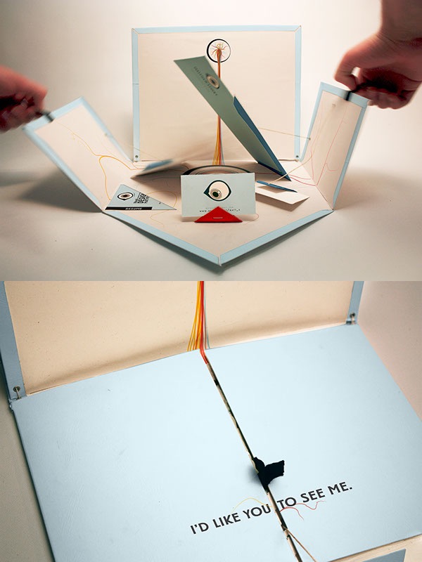
Matt Stucky went with the semi-literal approach as well. He wanted potential employers to see him for his work, his ability, and probably for an interview with his eye-catching resume. See more from Matt here (see what I did there?).
12. The All-in-One

Spanish graphic designer and kind human being Cesar Santiago Molina not only made eight colored versions of his resume set but made it available for download here. He also does custom resume work so if you’re looking for something a little more personalized, you can check out his works and contact him.
13. For the hipster jobseekers out there
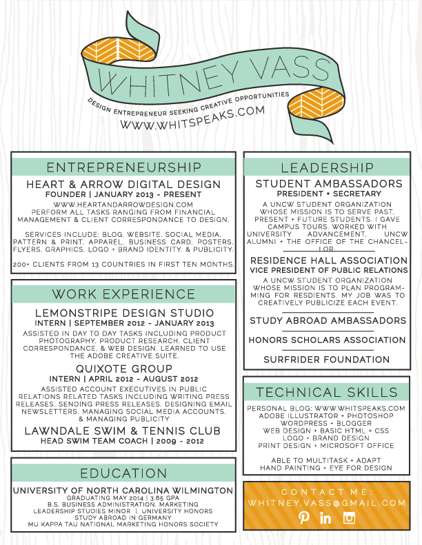
This pretty little thing is a mixture of hipster, hippie, and chic. There are a lot of textures and colors going on but the final product is a harmonious beauty. On her blog, whitspeaks.com, Florida native Whitney Blake shares her eye for design and style. She even teaches you How to: Make a Kick Butt Resume.
14. 007 goes job hunting
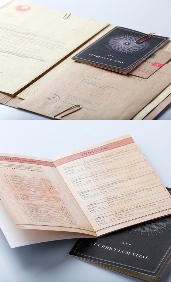
They might do things differently in Norway but Vidar Olufsen’s top-secret-but-not-so-secret resume is everything you didn’t know you wanted in your job application. From the copper paperclips to the ink-like typeface, he might even fool the CIA with this one. For more of Vidar’s work, click here.
15. Rainbow vectors galore
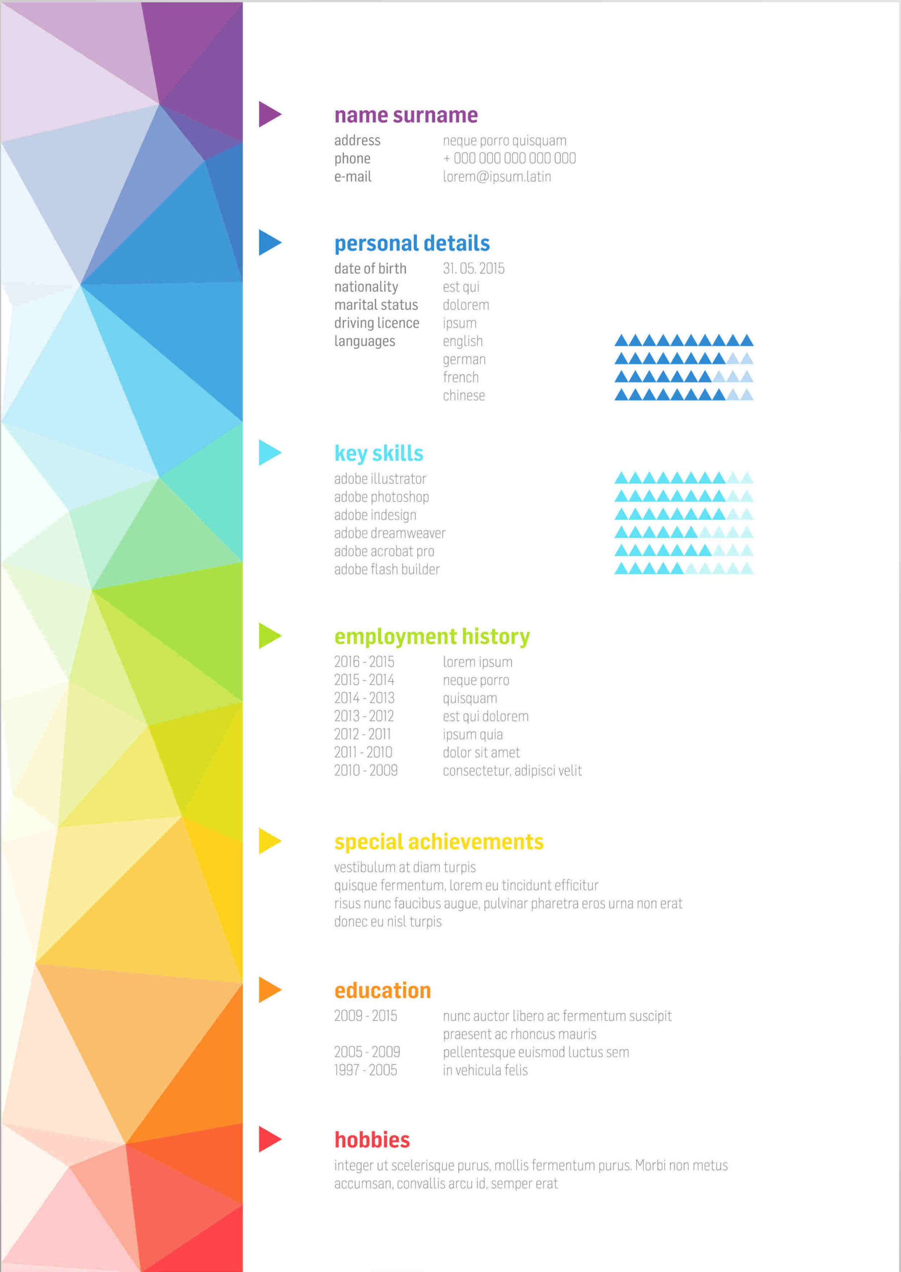
This one is for those whose inner unicorns are just waiting to come out. Shutterstock user roustignac went for the very simple but eye-catching, a theme that’s very much recurring in their portfolio.
16. QR Code
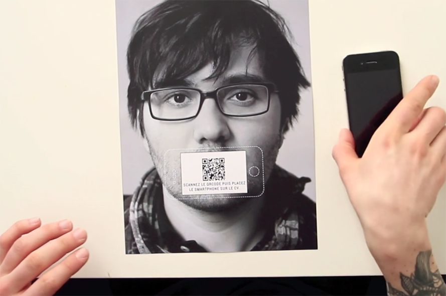
There are no words for this one. Good on you, Victor Petit, good on you.
How is your resume looking now? Test it out.
Sign up on Kalibrr today and find the right job for you. You can also subscribe to our weekly newsletter and get Kalibrr Career Advice straight from your inbox.



Belum ada komentar yang tersedia!