The Top 3 Graphic Design Principles for a Classic Resume


Before stepping up for a job interview, you need to pass the initial trial most jobseekers face – building your résumé. In a saturated job market, applying your personal brand to everything, including your résumé, is a necessity to make you stand out. Companies gather numerous applicants every day. In his article on ERE Media Header, thought leader Dr. John Sullivan approximates an average of 250 résumés received per job opening. With all those applications, it only takes at least 200 seconds, according to Dr. Sullivan, for an employer to make a lasting impression of you. This is why your résumé needs to show your qualifications immediately set you apart from the rest.
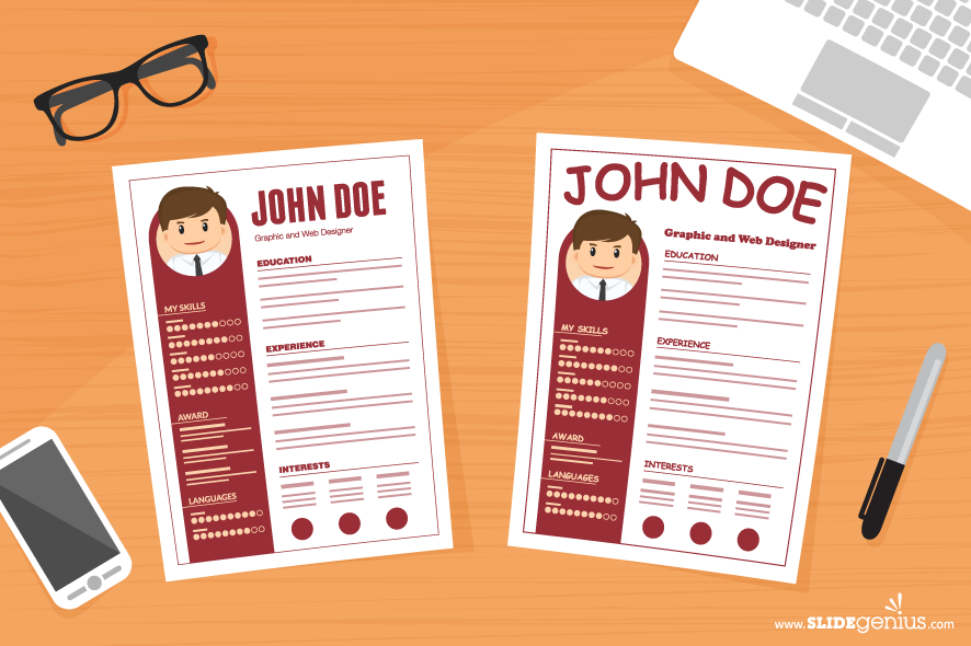
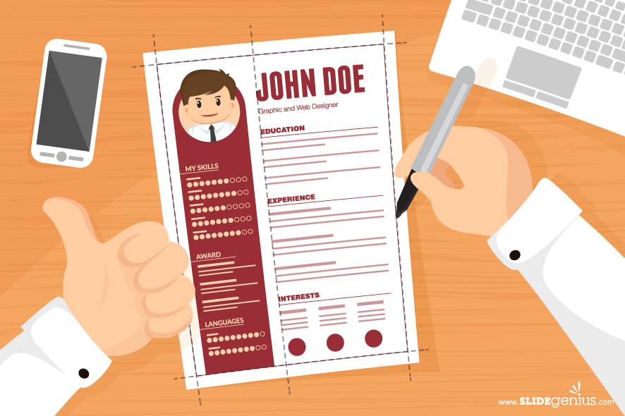
Although you have to craft a well-written résumé showcasing your strengths, skills, and background to get called up for an interview, the first thing that will catch people’s attention when they receive or open your résumé is its layout and design. You can get creative with your CV like how these graphic designers did with theirs. But if you’re not sure where to start when it comes to the visual aspect of a résumé, it’s good to go with a classic look: a straightforward, no-frills design that still gets the message across. Get noticed in the market with a simple but attractive résumé that appeals and compels its viewer to read on.
TOPICS
1. Use Appropriate Fonts
According to a study by US-based career consultation company, TheLadders, recruiters spend nearly 80% of their time on the following parts of a résumé:
-
- Name
- Education
- Current title/company with start and end dates
- Previous title/company with start and end dates
These key credentials give recruiters a brief introduction to you, so these need to be the most noticeable on your résumé. To craft a readable CV that draws interest to this information, use a legible font. Cover all the aspects of the font you use, including size, style, and combination. As a rule of thumb, you can have both serif and sans serif fonts to differentiate between headers and body text. Just make sure to stick to two font types to avoid distracting and confusing your recruiter’s gaze. Your goal is to bring your qualifications to the fore, not overshadow it with design excess. Serif fonts like Times New Roman and Garamond work best for the body of each section.
They help guide the eyes, making it easier to read long descriptions. Sans serifs like Helvetica and Futura are better used as headers because of their clean, streamlined look. These command immediate attention, and work best for making text stand out. Once you’ve settled on your choices, use the right font size to maximize readability. For descriptions and bulleted lists, it’s alright to retain the default font size, which is 11 or 12. Your headings and name are the things that will point to your content, so set a slightly larger font size without taking up too much space. Set your headlines apart with 14-16 points and format them to either bold or underline.
2. Apply Proper Spacing

Recruiters may tend to skim through your résumé due to the sheer number of applicants. Don’t make it difficult for them to read by saturating the page with too much information. The human brain can only take so much information at once. An overload of it will actually deter people from absorbing new data. The graphic design principle of white space, otherwise known as negative space, removes visible elements that could crowd your page. This lets employers focus on the meat of your application. But how do you apply negative space in a résumé? Since the bulk of your résumé will probably be text, avoid cramming too much of it in each part. Leave out images if they won’t show off your qualifications.
You’re given a very limited time to market yourself on a résumé, so put in only what counts. Instead of filling up your CV with buffer credentials, filter your content to the most relevant qualifications needed for the job you’re applying for, whether it’s about how you successfully managed projects in the past, to how well you’ve trained sales teams before. To know if your content is already compact, see how long your application would be with standard spacing sizes. Your entire résumé should be single-spaced, but with one or two spaces between each new section as suggested by Kristin Swan of Chron.com. You can also add borders if you want to define each section further, and make the divisions clearer. If your résumé ends up three pages long – or more – you may need to consider tweaking its content again. Recruiters won’t read through all of that information, so keep it to one page.
3. Fix Your Indentations
As with its line spacing, a classic résumé adheres to standard margin sizes. A one-inch margin around your page shouldn’t take up too much space, but shouldn’t be too crowded either. Don’t let your page overflow with words on the sides, but don’t make your margins too wide. After applying the right margin size, take a step back from your final output. Examining it from a distance lets you spot inconsistencies in your layout. Among these seemingly minor but important formatting details are your indents. In her comprehensive tips on résumé design, designer Chanpory Rith explains that while text indentation gives a sense of hierarchy that creates an easy transition from your headings and body text, too much of it can ruin your text harmony.
Modify the indents on your résumé for a cleaner layout. Ideally, only the body text should be indented, from at least half an inch from the heading. To do this, make use of the indent markers found on your document’s ruler. Avoid formatting the entire section you’re working on by selecting only the text you want to indent. You can also indent your content using the Increase/Decrease Indent commands found on your Home tab. This already moves the text to the half inch space you need. Having structured text shows that you are conscientious and meticulous about your work, unless it was intentionally formatted otherwise. For a symmetrical and visually satisfying CV, check your text alignment.
Bonus Tip: Smoothen Out the Edges

Your résumé is the first thing a recruiter receives to gauge your ability to be a good employee. It already says a lot about you, and how you format it gives the recruiter some insight on your personality. As a quick review:
- Use the appropriate fonts to appear professional and formal. You’re allowed to use different typefaces for headings and body text – serif for details, sans serif for headline – but stick to one font for each.
- Apply the spacing needed to balance between letting your résumé reader’s eyes rest, and listing down all your necessary credentials.
- Similarly, format your margins and indents to create a neat classic layout. Maintain the one-inch margin around your content, and a half inch indent for body text under each major section.
Let substance and form work together to win recruiters over. Make a good first impression with your résumé and move up to the next stage of your job application journey with a classic layout.
How’s your resume looking now? Subscribe to our weekly newsletter and get Kalibrr Career Advice straight from your inbox! Or follow us on Facebook, Twitter, and Instagram, or join Kalibrr’s Viber public chat for more career advice.
Rick Enrico is the CEO and Founder of SlideGenius, Inc., a global presentation design agency. He regularly publishes expert presentation tips on the SlideGenius blog. He currently oversees an experienced team of designers, software developers, and marketing professionals that specialize in creating custom corporate presentations and cloud publishing applications. Connect with him on LinkedIn and Twitter.


No comment available yet!